


The Challenge: River Rock Casino faced a difficult hand. Located about 90 minutes north of San Francisco, it struggled to attract younger visitors and compete with larger, flashier casinos like Graton. With a limited budget, an aging audience, and growing competition from online gaming, River Rock needed a way to stand out without pretending to be something it wasn’t.

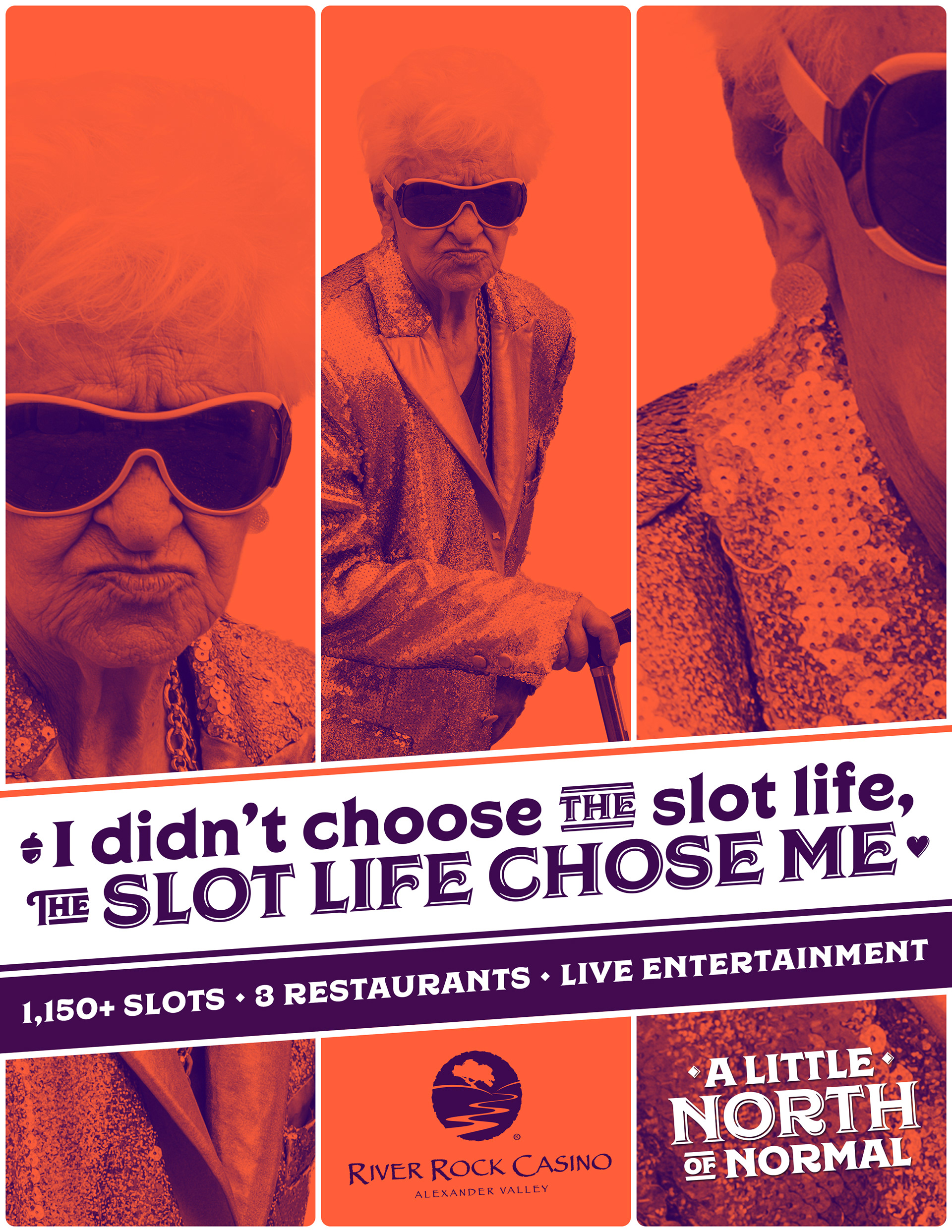
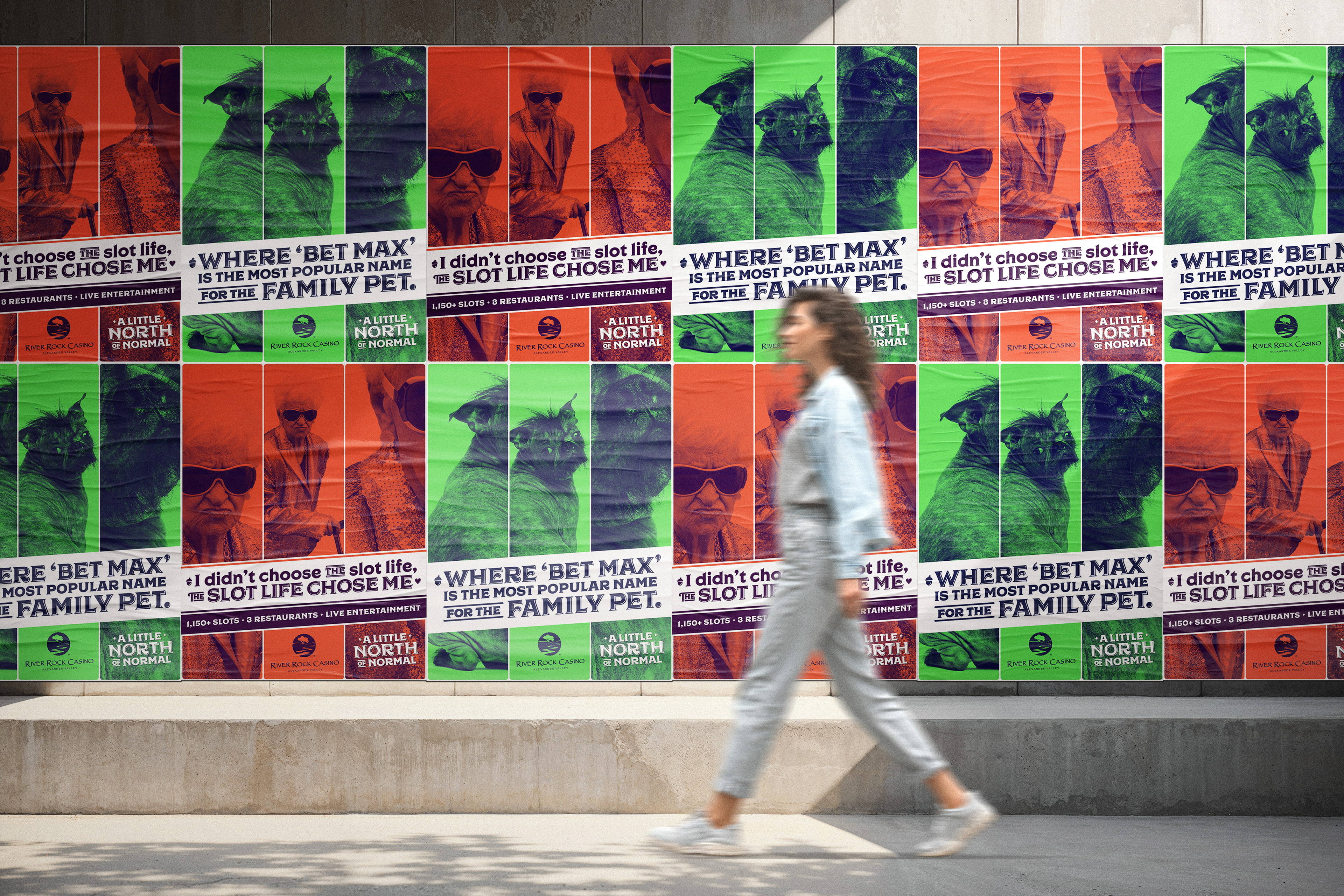
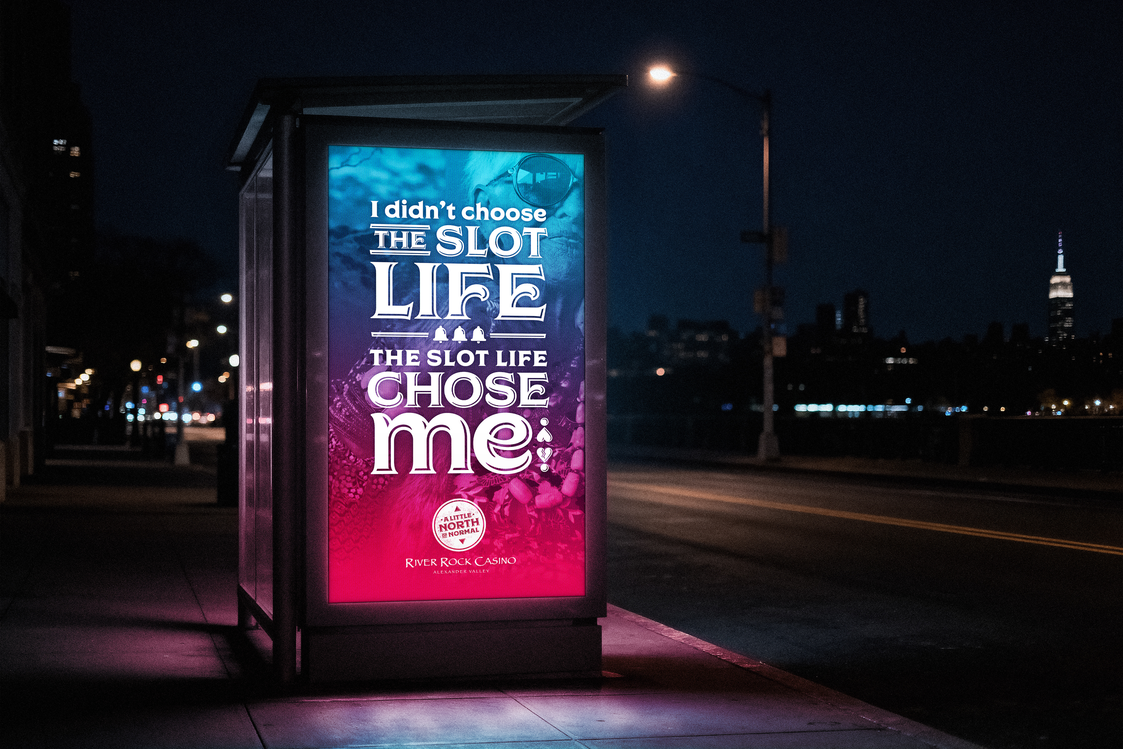
The Solution: The campaign centered on the idea “A Little North of Normal,” positioning River Rock as a quirky, down-to-earth alternative to the Vegas-style experience. Bright, high-contrast colors and bold typographic treatments gave the work a confident, playful personality. Campaign headlines captured the humor and charm of River Rock’s guests. The result was a visual and verbal identity that celebrated authenticity and community, making River Rock feel less like a corporate casino and more like a welcoming local escape.
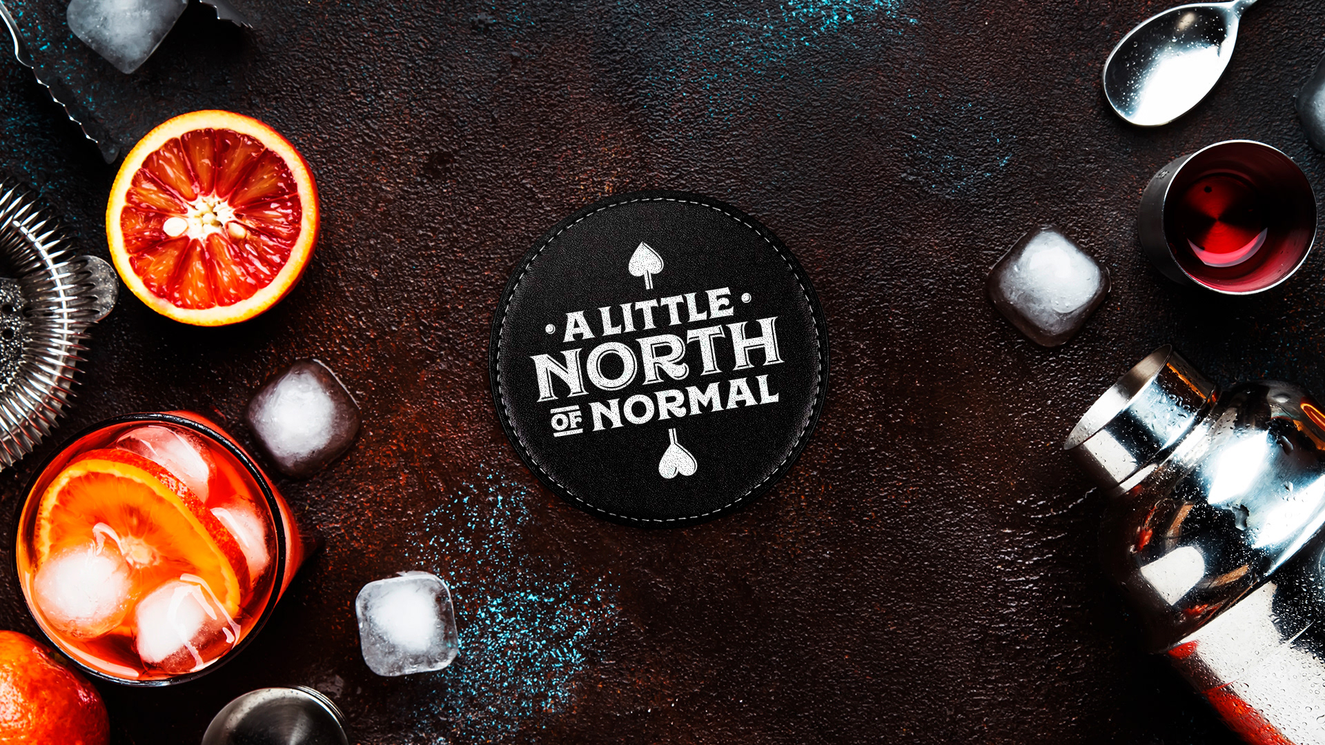
Triptych portraits mirrored the reels of a classic slot machine, creating a strong, repeatable graphic system. Vibrant duotone color palettes—orange, green, pink, and blue—gave each ad a bold, modern edge while keeping production costs low. The “A Little North of Normal” badge served as a unifying icon across print, outdoor, and merchandise, reinforcing the campaign’s personality at every touchpoint.


The Results:
The new positioning reenergized River Rock’s image, strengthening loyalty among regular players while sparking curiosity among new visitors. Increased local traffic and engagement showed that being “a little north of normal” was exactly what made River Rock stand apart.